Saturday, 28 January 2017

Order of Credits


Company Name: 1st
Main Star(s): 2nd/3rd
Title: 4th
Secondary Cast: 5th/6th
Casting: 7th
Co-Producer: 8th
Music Producer: 9th
Costume Design: 10th
Film Editor: 11th
Designer of Photography: 12th
Executive Producer: 13th
Screenplay: 14th
Director: 15th

Order of credits based on the 'Catch Me If You Can' title sequence.
The order is important as it reels the audience in and creates buzz; the company and main star(s) will attract the most people. Therefore, they are placed before the title is shown on screen.

Friday, 27 January 2017

Catch me if you can analysis


     Catch me if you can analysis.
     www.artofthetitle.com/title/catch-me-if-you-can/


For the title sequence for 'Catch me if you can' the creators, Olivier Kuntzel and Florence Deygas, were influenced by Saul Bass' work. This animated sequence begins with showing the production company, DreamWorks, following with the man stars before the title itself as they hold the most star power. There are arrows pointing to Leonardo DiCaprio's and Tom Hank's characters, as they start to move and interact with the text. The typography moves on the screen and becomes a part of the visuals, with characters leaning against the font and DiCaprio's character walking through it like a metal detector. It establishes the beginning setting of an airport and the audience the theme of travel, the soundtrack builds pace and tension while suiting to the time period which seems to be the 60s.

The title sequence is very unconventional as because as the title sequence progresses, it reveals the whole plot of the story, and the audience is made aware of the events that will unfold. It is made clear that the protagonist, Leonardo DiCaprio is on the run from Tom Hank's character, and keeps changing his identity/disguise while doing so. The key locations for the story are established when the scenes change colours; these are an airport, on holiday/abroad, hospital and finally a chase sequence. The sequence ends before the audience can tell wether or not the protagonist was caught, encouraging them to watch the film to find out what happens.

Friday, 20 January 2017

Film Case Studies


Genre: Thriller.
Se7en (1995)

Se7en's title was made by Kyle Cooper and was considered a game changer in the world of title sequences and heavy influences title sequences for shows such as 'American Horror Story.' The sequence itself looks very dark and grainy, with many clips montaged together consisting of many vague extreme/close ups, it connotes that the character's mind is a mess and in a state of chaos. It also presents him as the antagonist by keeping his identity hidden; this is narrative enigma as the audience does not know who he is. The typography is hand-written making the audience feel more involved. The sharp cuts and soundtrack make the viewer feel uncomfortable and sets up the tone for the film showing the genre. 


American Psycho (2000)

American psycho is minimalistic and has simple shots that trick the eye at first. With raspberry sauce looking like droplets of blood and someone’s arm cutting meat looking like someone cutting a body part, which confuses the audience but pulling them in more. These close ups lead to different types of food being served. The bright lighting and simple but calm soundtrack contradicts to the word 'psycho,' but could hint protagonist is neat and strategic. The title sequence also leads into the film in a very sleek way, making the title sequence blend in with the rest of the film


Dexter (2006)
The opening credits for Dexter focus on the protagonists morning routine from when her wakes up to when he leaves. This gives the audience an opportunity to meet and understand the character. There's a running theme of blood drops throughout the sequence which suggests the genre. However contrasting to this, the soundtrack is very light-hearted and easy to listen to, it does not hint that the protagonist is a serial killer. The sequence also uses close ups, similar to American Psycho, which gives everything the protagonist is doing a murderous intent to it; especially when he is cutting and squishing the orange. Near the end of the title sequence, the protagonist breaks the 4th wall and makes eye contact with the audience, this is effective as it adds an intense atmosphere and makes the audience feel like they're being watched.

Wednesday, 18 January 2017

General Research into Title Sequences


General Research into Title Sequences.


Incredible Hulk (2008)
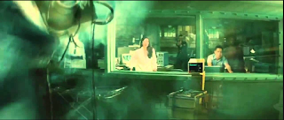
The opening credits act as a prologue to the film. It starts with a red danger button, which straight away hints to the audience that the genre in an action, with a voice over explaining what is happening while the protagonist is strapped to a chair.The use of a shot-reverse-shot between the protagonist and a female character sets up a romantic sub plot, as it hints the two are close, which is then supported by further scenes of the two through a flashback. The props, such as newspaper and photographs give the audience more context to what is going on. There is an intense parallel non-digetic soundtrack during the opening credits which gives the film a serious atmosphere. During the live action scenes the camera angle switches to a PoV shot, so the audience not only see what the protagonist does but also hides his identity as the Hulk creating narrative enigma. Throughout the opening credits there is a green tone to it, this represents the Hulk as the colour is a theme that runs through the whole film. 


 Love Actually (2003)


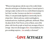
 The opening credits for Love Actually clearly states the genre of the film, romance, through achieve footage that capture peoples reactions when seeing their loved ones at the airport. The narrative voice over acts as Gods voice and and hints the genre through repeating the word "love." This title sequence is unconventional as it doesn't establish the plot and leaves the audience in the dark.


Se7en (1995)

The opening credits for David Fincher's Se7en changed the way opening credits were made due to Kyle Cooper 'breaking the mould.' The shots are all filmed close up, creating narrative enigma from  start as the audience does not know who is creating the journal or why they are doing it. The clips are not in chronological order and are montaged together, showing how frantic the character's mind is. Also by seeing the character create the journal, the audience learns that he is a sinister character hinting he is the antagonist.  The soundtrack consists of a scratching noise that makes the viewer feel uncomfortable, which adds to the atmosphere that helps show the genre, thriller.

To Kill a Mockingbird (1995)

The title sequence for to Kill a Mockingbird was filmed in black and white, with only the title ofitself being added in before post-production, it is shown through the child featured in the sequence writing it. It crabs along a box and shows various props but focuses on the whistle, this could signify the props importance. The sound also adapts throughout the sequence as the child’s humming changes to an orchestral piece. 


 Dr Strangelove (1964)


 The title sequence for Dr Strangelove is hand written typography added after the production of the film, which covers the majority of the screen, putting an emphasis on what the creators want the audience to focus on. There is also transitions between shots through two shots blending into one which is a dissolve.

Evaluation Question 1 & 5

A script was wrote by all of us. We wrote the parts that we were going to speak, with small improvements as we found necessary. We thought...